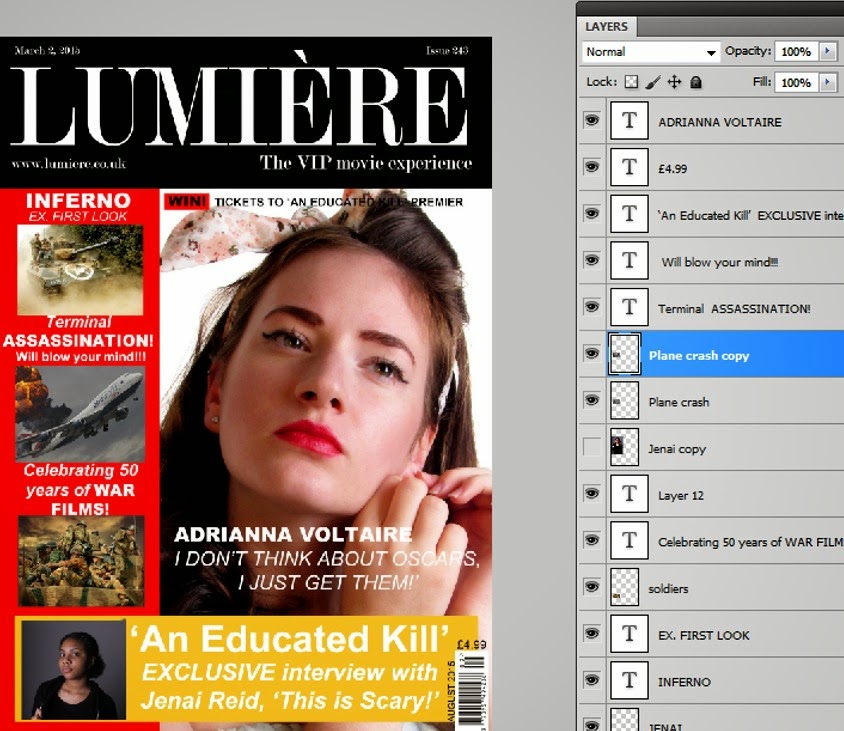
- Firstly, I opened a blank A4 sized page in Photoshop to begin the making of my front cover. I started to fill the page with he basic shapes which will be the different sections of the magazine cover. The top one being the masthead, the side being the film strip, and a place to put the featuring cover lines and finally the bottom rectangle being the main cover line, whilst the white space is the place for the main image.

2. Secondly, I have inserted all of the images and text in the right places whilst playing around with the font sizes and the order in which the text and images should be placed.

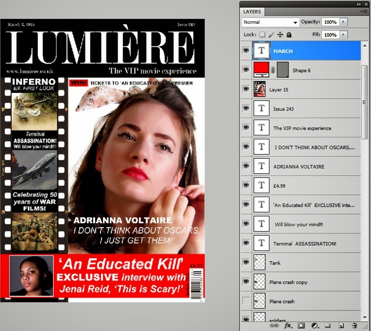
3. Finally, I made some last-minute changes. I swapped the bottom yellow space for red so it would match the red lipstick of the model as well as the red box acting as a highlighter in the sentence above the model's head. I also added a film strip to the red space on the left-hand-side which worked perfectly with the masthead colour and design.
 2. Secondly, I have inserted all of the images and text in the right places whilst playing around with the font sizes and the order in which the text and images should be placed.
 3. Finally, I made some last-minute changes. I swapped the bottom yellow space for red so it would match the red lipstick of the model as well as the red box acting as a highlighter in the sentence above the model's head. I also added a film strip to the red space on the left-hand-side which worked perfectly with the masthead colour and design.

No comments:
Post a Comment