I have decided to storyboard my ideas for the trailer, including some of the main shots and angles. The storyboard includes some simple sketches of the scenes and a small description of what the scenes consists of. These are many shots and text frames which I will have to include in the final trailer, however these are the main shots that I wanted to sketch out.
Showing posts with label a-level. Show all posts
Story board
Trailer synopsis
A teenage girl begins to receive strange
messages and signs whilst at school; she then begins to get nightmares and
strange messages (signs) in her head. Soon after she takes it upon herself to
investigate the situation with her friend(s) to get to the end of the
disturbing dreams and signs she keeps drawing and seeing.
As she begins to investigate she soon finds
out the horrific tale of an unsolved crime of a young girl who had been
murdered which she later finds out was a relative of hers. The teenage girl
begins her
unsettling and potentially dangerous mission to solve the investigation to
allow the
soul of the young girls to lay at peace.
Trailer transcript
Text:
Production credits
Sound:
Music starts
Establishing
shot of school (day
time)
Text:
Everyday you live the same routine/an ordinary life
Mid shot/Long shot of Jenai speaking about sleepover with friend(s)
Text:
Until the ordinary becomes extraordinary
Camera:
Jenai finds diary in her locker
Camera: Doodling the symbol in a notebook
Camera:
Jenai speaking uncomfortably with friends about her problem (Is it a prank?)
Text: And
history interferes with the present
Camera:
Jenai: “What
am
I supposed to do with this?”
Close-up:
Jenai is having a nightmare which turns out to be a vision of the ghost girl
Close-up:
Jenai
looks for articles in the library about Cecily Rose
Text: She is the chosen one
Camera:
Blood is left on toilet mirror when Jenai walks out of cubicle
Camera: A shadow passes the corridors of which Jenai walks along
Jenai: "Hello?" *She looks around*
Over the shoulder:
Jenai: “why
did
she choose me?”
Leah: “you
must
have something in you.”
Jenai: “My great grandmother was a
Rose”
Camera: Cecily Rose appears. Jenai: "Why can I see you?"
Cecily Rose: "I've been channelling your soul."
"You have to hurry."
Camera: Jenai finds a spell in her locker with symbolic instructions of the process that Cecily Rose wants her to carry out used to fight dark spirits.
Text: (title) An Educated Kill
Text:
In Cinemas
October 19
Website: www.educatedkill.com
#AnEductedKill
Company logo
Film title
Based on the knowledge of the sequence of the scenes and the whole idea of the trailer being established, I felt that it would be easier to come up with the title of the film at this stage in the pre production process. I began by brainstorming rough ideas based on the theme and conventions of the film.
I decided to pick my top three movie titles which I thought are the most appealing and would be most successful. To make the process unbiased, I carried out a small survey and asked 27 people (aged 12-18) the following question with the following answers and results:
Based on the results seen above, it is visible that all three titles came pretty close however the one that people found most appealing was 'An educated kill' which I am happy to follow up with the decision that this will be the the title for my film.
Production logo and name development
Based on my creative observation into film companies, I have come up with a production name and logo design. I have also carried out a quick survey asking 16-18 year old's about their opinion on my company names and which one they liked most. Based on the results, it is visible that Mountain Peak Production was the most popular of them all, although I was considering film maker entertainment as one of the two.
Below are the three designs of my company logo which I have constructed. The designs are quite basic, however I have created different designs, used different colours selected different font styles and sizes. My initial logo design has been inspired by the big film companies including Columbia, Paramount and Summit. I also realized that based on Summit, my logo does not need to be very detailed and sometimes simple sketches and outlines are highly effective. Regardless, I am planning to choose my favourite logo (the top one) and experiment further in Photoshop.
Remaining props: design and implementation
For the key props that I have already listed, I was able to go to a shop and buy them already made based on my ideas. Some remaining purchased props are: fake blood, folders and school supplies. However, some props require in-house making to really make them personalized and meaningful to the film/trailer.
Library scene: old articles about Cecily Rose's death

Library scene: old articles about Cecily Rose's death

Magazine cover
- Firstly, I opened a blank A4 sized page in Photoshop to begin the making of my front cover. I started to fill the page with he basic shapes which will be the different sections of the magazine cover. The top one being the masthead, the side being the film strip, and a place to put the featuring cover lines and finally the bottom rectangle being the main cover line, whilst the white space is the place for the main image.
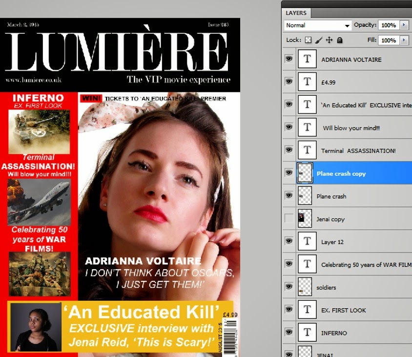
2. Secondly, I have inserted all of the images and text in the right places whilst playing around with the font sizes and the order in which the text and images should be placed.
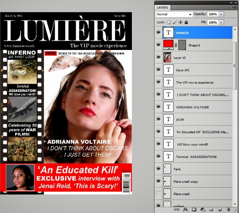
3. Finally, I made some last-minute changes. I swapped the bottom yellow space for red so it would match the red lipstick of the model as well as the red box acting as a highlighter in the sentence above the model's head. I also added a film strip to the red space on the left-hand-side which worked perfectly with the masthead colour and design.
Subscribe to:
Comments (Atom)


